
Design


2024-2025 News
Magazine
Designing these facing pages was unique. The design for my column is centered around coffee and filtering. For this edition that meant using shades of brown and to make the pages congruent despite their vastly different topics I used a similar font and coloring for the opposing page. After we published I learned a viable lesson in print journalism, in that sometimes things print different then how they look on the PDF. On the PDF my text was readable, if not ideal, but in print I received an email from a teacher that it was a lot more difficult to read. She loved the text but would love if it was more accessible so I kept that in mind for next time.
2024-2025
Yearbook
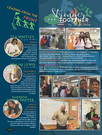
For this design I wanted to make sure I really captured the community of Empowered Club. I did that by featuring the leaders who had been so close to the leaders that came before them. Furthermore, the opaque image that is part of the background is the classroom where meetings are held.
2023-2024
News Magazine
This article specifically had a few bumps along the road, I had been busy helping with other articles so I had the person on this story take the lead. There was miscommunication on the angle of the article and it ended up needing a complete rewrite the day before we sent to printer. So when it came to designing I was short on photos to use in my design. Instead, I created a rectangular pattern to add to the design and utilized some graphics that I designed on Canva.


2023-2024
Yearbook
When ever I would work with archival journalism, such as yearbook, I always did my best to prioritize photos and quotes which really came through in this spread about the school trips that took place over the summer.


2022-2023
News Magazine
This design was meant to encompass Spotify's vibe but not be an outright copy. We also wanted to add in elements of aux and headphones. Designing this page using free use items was a challenge that persisted throughout the design process.
2021-2022
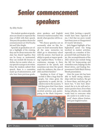
News Magazine
This design really featured school spirit, or as our school calls it, Huskie pride. The spread was about our commencement speakers and the dominate colors are orange, brown, and white.

2021-2022
News Magazine
This design featured the Tik Tok blue, black, and red to represent the platform "devious licks" started on. The image on the left was a sign that was put up in my school announcing the bathroom closures as result of the destruction, I then faded over it with the Tik Tok colors.